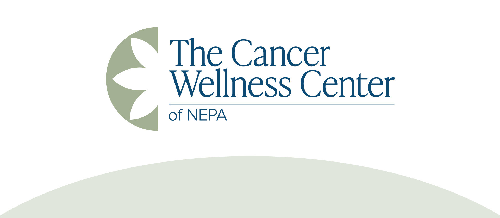
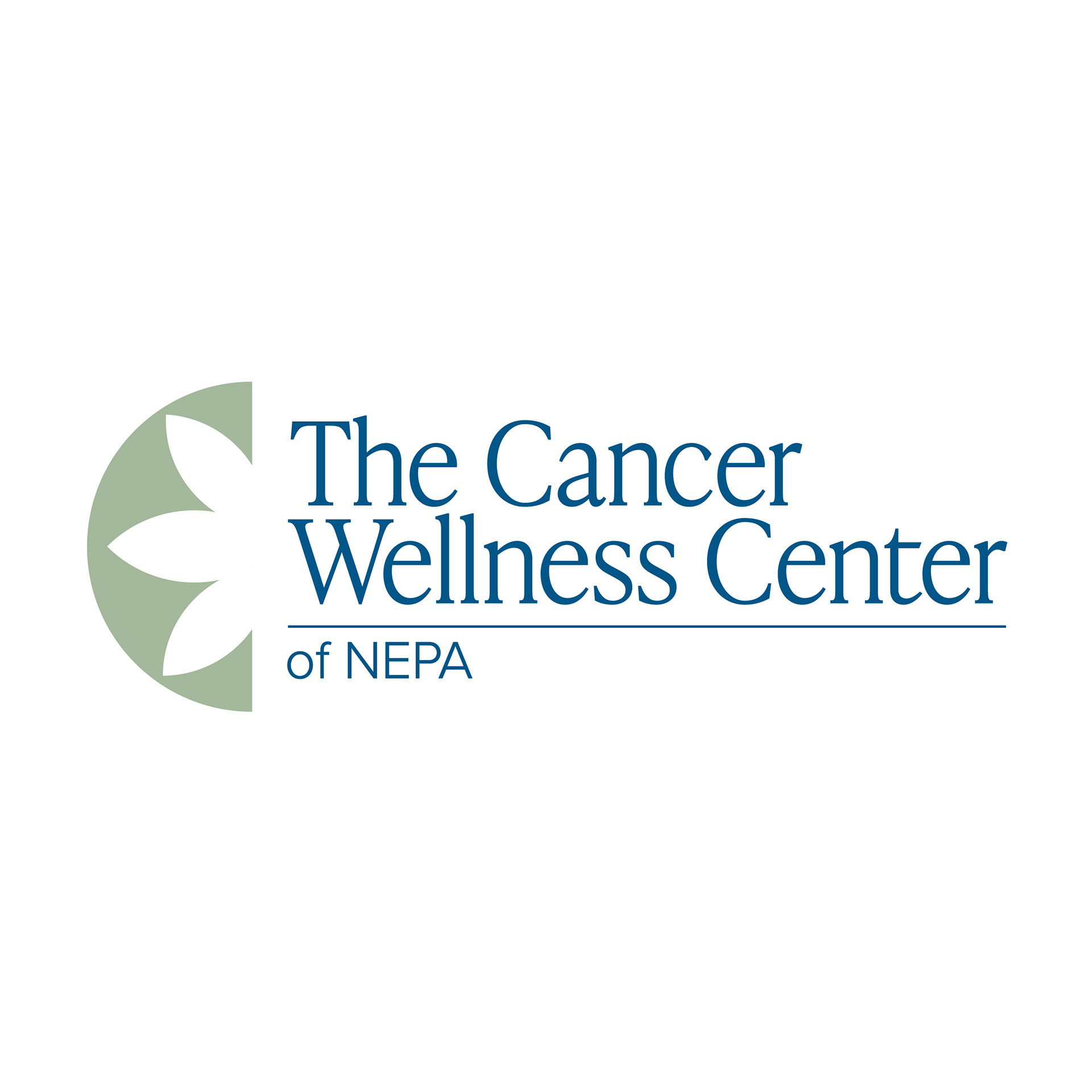


The Cancer Wellness Center, formerly known as Candy's Place, is a well known non-profit in Northeastern Pennsylvania. They wanted a rebrand to feel more gender neutral and appeal to more male clients, as they were misconceived as an organization meant for women. I went with a 'C' created from the negative space left by a lotus flower, a symbol for healing and rebirth. Calm and cool colors inspire healing and relaxation, while also being welcoming to all. I used a serif as my main font to display the vulnerability yet also the strength of this organization and its clients while also maintaining a sophisticated look.